You are using an out of date browser. It may not display this or other websites correctly.
You should upgrade or use an alternative browser.
You should upgrade or use an alternative browser.
Wolves Kit Thread
- Thread starter Lupo
- Start date

- Joined
- Oct 5, 2010
- Messages
- 23,007
- Reaction score
- 7,133
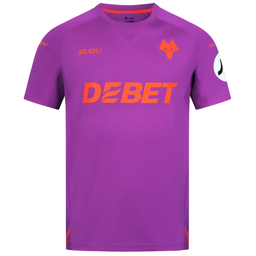
2024-25 Wolves 3rd Shirt - Adult
<p>2024-25 Wolves 3rd Shirt - Adult</p> <p>Bold, rebellious and fearless, the Third Shirt embodies the spirit of the club.</p> <p>Designed by SUDU in collaboration with the playing squad team, this shirt captures the attacking essence of Wolves football. It's crafted with premium materials to...
 shop.wolves.co.uk
- Joined
- Oct 5, 2010
- Messages
- 23,007
- Reaction score
- 7,133
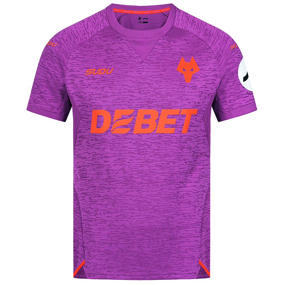
2024-25 Wolves Pro 3rd Shirt - Adult
<p>2024-25 Wolves Pro 3rd Shirt - Adult</p> <p>Engineered for elite performance, the PRO Third Shirt is the Wolves' secret weapon.</p> <p>Crafted by SUDU with premium materials, this shirt delivers on comfort, breathability and durability – with textured details that enhance the bold design...
shop.wolves.co.uk
- Joined
- Aug 10, 2011
- Messages
- 64,210
- Reaction score
- -39,552
That range was advertised on social media
- Joined
- Oct 5, 2010
- Messages
- 23,007
- Reaction score
- 7,133
I quite like that one. A pity that wasn't chosen as the 3rd kit.
Alan
…unlucky Del - No chance 😉
- Joined
- Nov 30, 2012
- Messages
- 46,695
- Reaction score
- 14,436
Would be really nice if there weren't three different shades of violet going on.
Also, "Navy"? The fuck kinda navy blue is that?
- Joined
- Nov 5, 2009
- Messages
- 53,587
- Reaction score
- 5,224
Well the actual layout of the shirt is fine, there's nothing particularly wrong with any of it.
Except the colour. And when the colour is so utterly revolting, that's sort of important. It's kind of hard to see past that, especially when it burns your retinas.
Except the colour. And when the colour is so utterly revolting, that's sort of important. It's kind of hard to see past that, especially when it burns your retinas.
lemonjelly
Housecoat, la
- Joined
- Mar 12, 2010
- Messages
- 21,607
- Reaction score
- 3,107
i think in your desire to rage the joke whooshed over your head...I refer you to my post above. If there were a collar to get aerated about that would actually be a step in the right direction.
or my jokes are shit
(both the above may be true...)
BillyDee
Part of the London Metropolitan elite.
- Joined
- May 20, 2013
- Messages
- 7,046
- Reaction score
- 3,107
I don't get the vitriol.
Yes, it's a bit plain, I'd prefer some sort of actual collar.
I like that they've done something different with the badge. I'd like if they brought back the leaping wolf or WW for a 3rd kit.
I really don't get the hate for the purple colour though, other than it makes it look like a GK shirt.
I'd certainly be happier getting this in my end of season mystery bag than I was getting the home kit last season....
Does he balls. He likes his inside info.Dazzling likes it so fuck you all...
That's actually a huge amount better than the outfield kit! Actually has some contrast so that you can see stuff.
They can fuck off with their £58 though. Johnstone is No.31 isn't he? How about 31% off, otherwise who the hell is buying that?

Jinky
Typical Fosun
- Joined
- Oct 28, 2009
- Messages
- 36,986
- Reaction score
- 10,689
Why?View attachment 11586
Tempted to get one of these for holidays.
Tyrannosaurus Dan
Colonel Sanders
- Joined
- Jan 20, 2012
- Messages
- 19,689
- Reaction score
- 3,858
My first thought was also surely nobody is going to pay £58 for a 3rd GK top?!That's actually a huge amount better than the outfield kit! Actually has some contrast so that you can see stuff.
They can fuck off with their £58 though. Johnstone is No.31 isn't he? How about 31% off, otherwise who the hell is buying that?
PuntsWolf
Well-known member
- Joined
- Sep 21, 2010
- Messages
- 16,994
- Reaction score
- 9,109
Agreed. If it was black, white, teal or whatever everyone would probably love it. Nothing wrong with plain IMO. That first PL season home shirt is still one of the best ones, and the simple designs from the last two seasons also.I don't get the vitriol.
Yes, it's a bit plain, I'd prefer some sort of actual collar.
I like that they've done something different with the badge. I'd like if they brought back the leaping wolf or WW for a 3rd kit.
I really don't get the hate for the purple colour though, other than it makes it look like a GK shirt.
I'd certainly be happier getting this in my end of season mystery bag than I was getting the home kit last season....
ROVERT47
ACTUAL PROPER ITK
- Joined
- Feb 3, 2010
- Messages
- 10,416
- Reaction score
- 1,750
Why not?Why?
Lupo
Well-known member
- Joined
- Apr 1, 2012
- Messages
- 8,902
- Reaction score
- 5,922
Yes, same design but in white with the collar, cuffs and logos in black would probably go down pretty well. The current vogue though does seem to be for pushing the boundaries with 3rd kitsAgreed. If it was black, white, teal or whatever everyone would probably love it. Nothing wrong with plain IMO. That first PL season home shirt is still one of the best ones, and the simple designs from the last two seasons also.
Tony Towner
Well-known member
- Joined
- Feb 18, 2010
- Messages
- 42,060
- Reaction score
- 30,219
Because it's an enormous logo of a made up brand and a small Wolves one. Colour, design, style are personal taste, but surely you'd want something which was Wolves first?Why not?
Similar threads
- Replies
- 122
- Views
- 3K