You are using an out of date browser. It may not display this or other websites correctly.
You should upgrade or use an alternative browser.
You should upgrade or use an alternative browser.
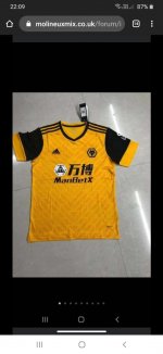
New Kit Thread - slag off what you want in here
- Thread starter Norman Deeley
- Start date
Elephant Pyjamas
Well-known member
- Joined
- Jul 12, 2011
- Messages
- 19,438
- Reaction score
- 14,674
I like the Ian Hislop one.
Elephant Pyjamas
Well-known member
- Joined
- Jul 12, 2011
- Messages
- 19,438
- Reaction score
- 14,674
Bloke on ashma for sale Facebook page was advertising new shirts,with the black sleeves and manbet sponsor on sale from his front garden early next week,im guessing probably not official merchandise
How much??
Tyrannosaurus Dan
Colonel Sanders
- Joined
- Jan 20, 2012
- Messages
- 19,680
- Reaction score
- 3,850
It actually looks ok with Doritos on :icon_lol:
I like it more than I thought I would. I presume the lack of a sponsor means we're having a new one?
I like it more than I thought I would. I presume the lack of a sponsor means we're having a new one?
Keef
Celebrity Slayer
- Joined
- May 5, 2013
- Messages
- 6,040
- Reaction score
- 2,488
How much??
I have no idea,all his other wolves shirts went for about £20, so maybe £20
Elephant Pyjamas
Well-known member
- Joined
- Jul 12, 2011
- Messages
- 19,438
- Reaction score
- 14,674
The colour appears to be nearer the 18/19 than this years?
Elephant Pyjamas
Well-known member
- Joined
- Jul 12, 2011
- Messages
- 19,438
- Reaction score
- 14,674
There can't be many teams who change their colour as frequently as we do!
Deutsch Wolf
Sponsored by Amazon Prime. DM me for discounts...
- Joined
- Oct 16, 2009
- Messages
- 113,411
- Reaction score
- 44,080
Looks horrendous to me. The fuck is that pattern? Like shit 80s wallpaper.
AndyWolves
Well-known member
- Joined
- Oct 28, 2010
- Messages
- 18,419
- Reaction score
- 8,929
That looks way too orange for me
Templeton Peck
Well-known member
- Joined
- Feb 2, 2010
- Messages
- 8,479
- Reaction score
- 4,137
Nope. And it's fucking orange.
Perfect kit was the last promotion one. Or the Ketsbaia one.
Perfect kit was the last promotion one. Or the Ketsbaia one.
jd1981
Well-known member
- Joined
- Apr 26, 2011
- Messages
- 18,794
- Reaction score
- 6,700
Not for me at all, the home shirt should have minimal amount of black in it basically I’m no fan of black sleeves. The pattern on it makes it look like some the Sunday league strips I use to play in.
Keep it simple and don’t try to be to clever and it’ll always look better.
Keep it simple and don’t try to be to clever and it’ll always look better.
Norman Deeley
Dean Saunders's Press Officer
- Joined
- Feb 13, 2012
- Messages
- 5,915
- Reaction score
- 152
It doesn't look like a coherent kit to me. Looks like someone has taken the body from one shirt and the sleeves from another and photo-shopped them together. There's no-one on this forum who couldn't design a better kit than that...
Elephant Pyjamas
Well-known member
- Joined
- Jul 12, 2011
- Messages
- 19,438
- Reaction score
- 14,674
If we have black socks as well we'll look more like Hull than Wolves.
Similar threads
- Replies
- 283
- Views
- 15K
- Replies
- 108
- Views
- 6K
- Replies
- 160
- Views
- 9K


