• Welcome, guest!

    This is a forum devoted to discussion of Wolverhampton Wanderers.
    Why not sign up and contribute? Registered members get a fully ad-free experience!

New Kit

Looks a bit naff in the close up with Jack Price. Nothing against the pinstripes personally, could've been a good kit if it was halfway decent quality, lost the black bit under the arm and had a decent sponsor.
 
Looks like a palin back from the email I've just received:

imgpers.ashx
 
In your 139 years of supporting Wolves, which one was the worst in your opinion?

I cannot remember the year, but the one which looked like a pigeon had been sick all over it. Not a fan of that one at all.
 
I like it apart from the sponsor.

I quite like that - except the yellow stain under the logo.

Personally, I find the sponsor no worse than Sporting Bet - at least the font is in black and not blue and red. With another logo, I think I'd really like it, as opposed to just thinking it's 'pretty good'.

I agree with the above. In fact, I'd buy one if you had a community trust or sponsor free option. Simple but effective.

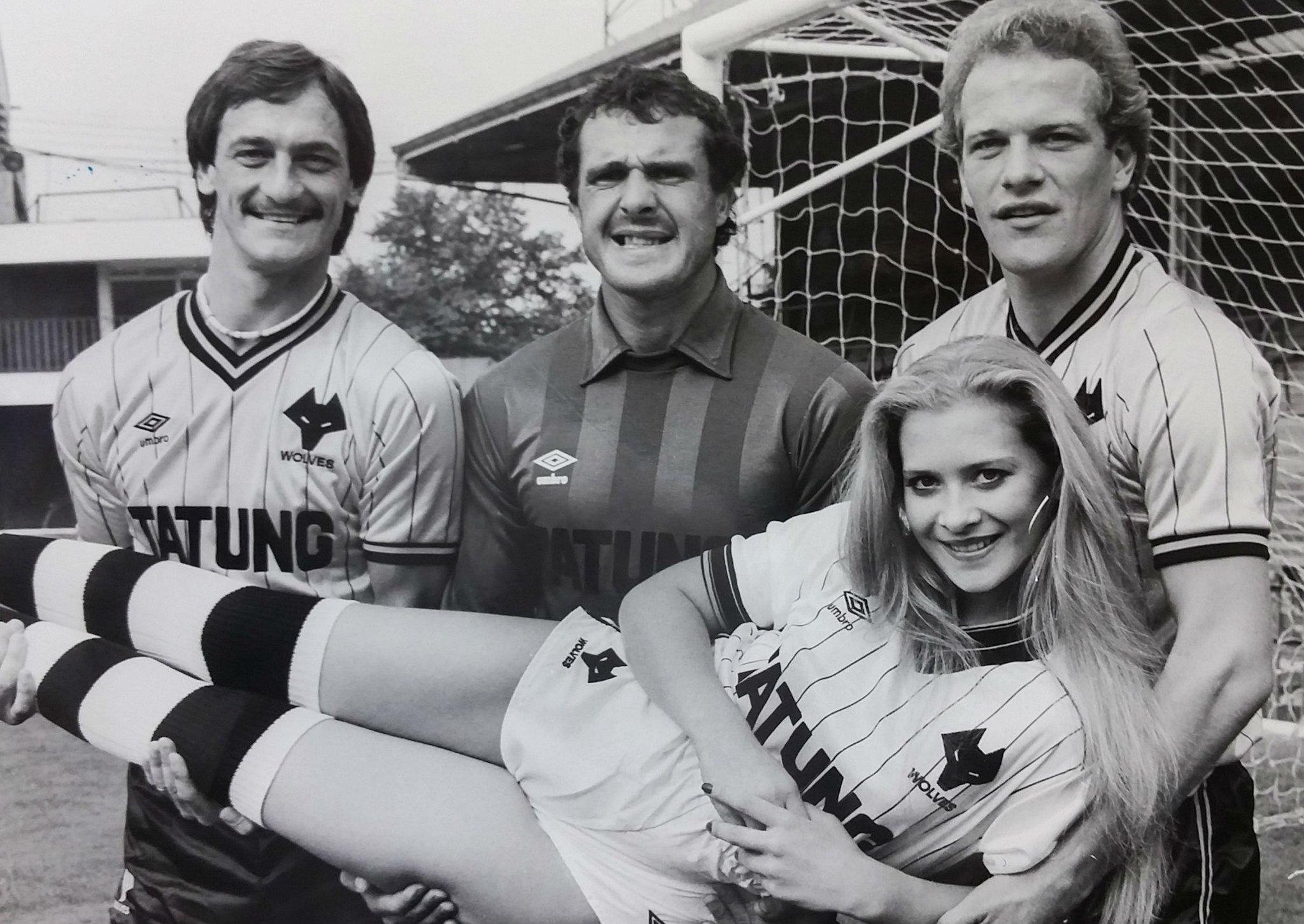
We had pin stripes in the early 80's. Everyone had them FFS.
 
Best shirt of the PUMA era (which doesn't say much)

The release video was teeth itchingly tacky.

Nah ..........
 
I can't wait for Hull to reveal their new shirt for 2016/17 season...Just so I know what our 2017/18 shirt will be like.
 
Dont like it, exactly like Hull
 
First thought that entered my head was "Hull".

It doesn't even look like a particularly good fit. Disappointing.
 
We're all worn out on Adidas stateside since they have all MLS kits but I'd probably murder to have an Adidas-branded Wolves kit. The weirdest thing we'd have to worry about would be three black stripes on the shoulder.

I don't know who is designing shit for Puma but they need to stop.
 
I like it a lot but the yellow line under the sponsor ruins it.
 
Back
Top