• Welcome, guest!

    This is a forum devoted to discussion of Wolverhampton Wanderers.
    Why not sign up and contribute? Registered members get a fully ad-free experience!

New Kit

Tim II dug this up on Twitter:

CiLIsEzWkAAhNHJ.jpg:large

Pinstripes brings back the old nostalgia, lost our first 7 games wearing that kit and were down by March in a Villaesque campaign,

ah happy days...

This one isn't as bad as a few of the recent ones but your first thoughts are Hull, the yellow stripe is shite as well.
 
Don't hate the stripes, like the black on the sleeves, hate all logo's especially this one, as for the streak of yellow.....goes well with our selection policy
 
Shame I would hate it whatever it looks like due to the sponsor as without this I like it
 
It's so shitblisteringly similar to Hull's kit that I can't even imagine us wearing it.

safe_image.php


At least the away kit can't possibly any worse, even if it is lime green.
 
It's so shitblisteringly similar to Hull's kit that I can't even imagine us wearing it.

safe_image.php


At least the away kit can't possibly any worse, even if it is lime green.

Yet every time I've seen Hull this season I've thought how similar it is to our 2014-15 shirt
 
I quite like it and normally I am disappointed. The sponsor not so great though, whack Goodyear on the front and it's a keeper.

Sent from my SM-G901F using Tapatalk
 
Me and Alan are so blissfully unaware of the shitpile that The Money Shop are.

I may honestly buy one because no one in Florida will know what the fuck they are either.
 
Yet every time I've seen Hull this season I've thought how similar it is to our 2014-15 shirt

Think the best one we've had recently was the one we had when we got relegated from the Championship under Saunders. I put mine on the other day for the first time in ages, and I remembered that I bloody love it.
 
Just checked my e-mails and saw that I'd been sent a preview, haven't been on here since this morning so immediately logged on to see how many pages we were up to, 3, not bad.
I like it and shall be getting one.
 
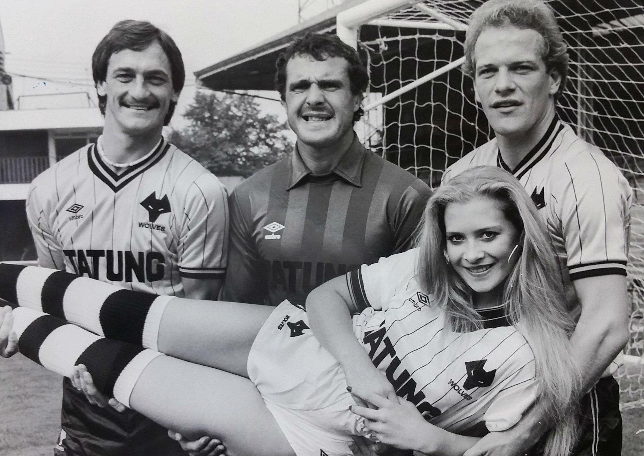
If the pinstripes were all over a la the Tatung strip it would be OK. I still wouldn't buy one though as those necklines reveal too much of my cleavage.
 
The kids version is fucking ridiculous. The square where the sponsor sits is still there. So the pin stripes stop for no reason
 
It's because they want you to put the logo on, which they will do for free. It was a last minute decision so they aren't going to redesign
 
If the pinstripes were all over a la the Tatung strip it would be OK. I still wouldn't buy one though as those necklines reveal too much of my cleavage.

It's got a round neck Gav.
 
I really like it and will more than likely get one, i have no issue with anything including the sponsor.
 
Best kit this century IMHO .

No chance, the Burrda kit from the Ståle/Deano season was an all-timer. Can't speak to the quality of it obviously but the design was top, top class.
 
Love the 80's stripes. Hate the hexagon surrounding the badge. Our badge looks so much better on the Tatung kit.
 
No chance, the Burrda kit from the Ståle/Deano season was an all-timer. Can't speak to the quality of it obviously but the design was top, top class.
Unfortunately, the quality was about as high as the standard of football during that season. By far and away the worst quality football shirt I've ever bought!!
 
Back
Top