You are using an out of date browser. It may not display this or other websites correctly.
You should upgrade or use an alternative browser.
You should upgrade or use an alternative browser.
Wolves Kit Thread
- Thread starter Lupo
- Start date
- Joined
- Aug 10, 2011
- Messages
- 64,074
- Reaction score
- -39,767
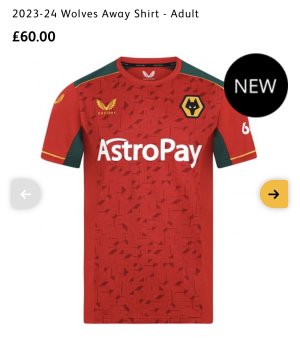
Going for the Spanish vibe from the bollocks blurb on the launchDon't mind the style but the colour scheme is shit.
I presume it's for the Chinese market where red is associated with prosperity.
but works for
China - Lucky Red
Korea - Red Tops
Getting all target areas covered. Efficient brand building 101
Johnny75
Virtual Cock
- Joined
- Oct 24, 2011
- Messages
- 36,291
- Reaction score
- 12,474
Apart from the fact it's impractical and looks a bit shit.Going for the Spanish vibe from the bollocks blurb on the launch
but works for
China - Lucky Red
Korea - Red Tops
Getting all target areas covered. Efficient brand building 101
All boxes ticked then.
Carrotdude
Well-known member
- Joined
- Feb 3, 2010
- Messages
- 8,868
- Reaction score
- 1,928
It’s does look better on the players than in the picture but I always prefer a black away kit with old gold trim
- Joined
- Nov 5, 2009
- Messages
- 53,569
- Reaction score
- 5,191
Apart from the fact it's impractical
Why? Is the neck sewn up or something?
darlowolf64
Supply Teacher & 2020/21 PTG Intertoto Cup winner
- Joined
- Jan 15, 2010
- Messages
- 31,091
- Reaction score
- 3,874
I'm not sure it does...It’s does look better on the players than in the picture but I always prefer a black away kit with old gold trim
Absolutely this. Was just going to say the same.The away kit should be a black or white every year. If you want to piss about with different colours save it for the 3rd kit.
- Joined
- Aug 10, 2011
- Messages
- 64,074
- Reaction score
- -39,767
Johnny agreesTime for my yearly "nothing has beaten my black away shirt with the 'Fosun' sponsor on it" post.
Lycan
Official spokesperson for the entire fan base...
- Joined
- Jan 14, 2010
- Messages
- 19,730
- Reaction score
- 11,495
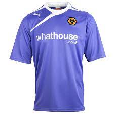
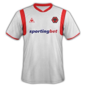
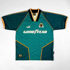
That teal Wolf head one is a classic. Loved that shirt when I was a kid.A positive is that it hasn't made my top 3 of shite away tops.
1) Lilac monstrosity.
2) White Sporting Bet
3) Teal wolf head
View attachment 7668
View attachment 7669
View attachment 7670
PuntsWolf
Well-known member
- Joined
- Sep 21, 2010
- Messages
- 16,925
- Reaction score
- 9,000
PuntsWolf
Well-known member
- Joined
- Sep 21, 2010
- Messages
- 16,925
- Reaction score
- 9,000
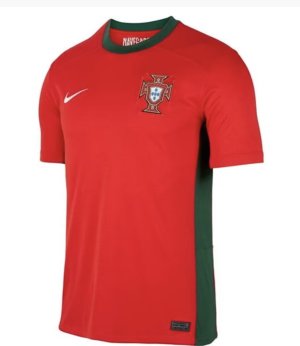
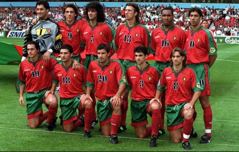
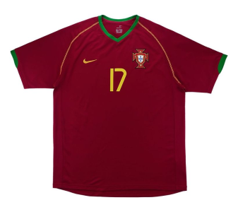
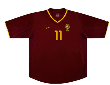
Yeah I’m the Rui Costa/Figo days in my head but probably still not as dark.Wasn't there a period though when the Portugal kit was pretty much the colour of our 3rd kit?
Or is that some kind of Mandela Effect shit?
Jack Regan
Hodor. Hodor? HOOODOOOOR!
- Joined
- Feb 4, 2010
- Messages
- 10,715
- Reaction score
- 4,294
Similar threads
- Replies
- 122
- Views
- 3K

