• Welcome, guest!

    This is a forum devoted to discussion of Wolverhampton Wanderers.
    Why not sign up and contribute? Registered members get a fully ad-free experience!

New Kit Thread - slag off what you want in here

I've just had another look at it again and yeah its shite. I thought we were better at things like this now.

The only saving grace over me having to hand over the best part of £100 for the kids tops is that at least they won't have the Manbet explosion all over it
 
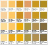
It’s almost as bad some of the Burrda offerings. The colour is hideous. They had that perfect last year so don’t fuck with it. The collar and badge colours being last years shows the huge error in pantone. The pattern is awful and adds absolutely fucking nothing apart from making it bloody worse. The sponsor logo is shit as well.

Apart from that, a triumph.

Ditto and it’s overpriced
 
Right mine has just arrived.

Fair to say the image posted on Twitter is closer to the truth than the pictures posted by Wolves. The colour of the collar against the 2 tone orange is not a good look. They would have been better keeping the base colour of the shirt the same as last year and just using a darker tone of that for the pattern.

I liked the press release pictures but the actual product is not good at all. Will be returning mine today.
 
f7a1903f1a9036ca25823e1843a487f4--pantone-gold-cream-and-gold.jpg

I just don't see why we have gone back to orange, its bugged the hell out of me for years
 
Unprecedented positive reaction to last years shirt design and colour, unprecedented sales. So why change it so radically?
 
Right mine has just arrived.

Fair to say the image posted on Twitter is closer to the truth than the pictures posted by Wolves. The colour of the collar against the 2 tone orange is not a good look. They would have been better keeping the base colour of the shirt the same as last year and just using a darker tone of that for the pattern.

I liked the press release pictures but the actual product is not good at all. Will be returning mine today.

Sounds like this is one to miss. I've ordered some of the new training gear instead - no sponsor, nothing orange. Ideal.
 
Right mine has just arrived.

Fair to say the image posted on Twitter is closer to the truth than the pictures posted by Wolves. The colour of the collar against the 2 tone orange is not a good look. They would have been better keeping the base colour of the shirt the same as last year and just using a darker tone of that for the pattern.

I liked the press release pictures but the actual product is not good at all. Will be returning mine today.
The pics linked by Weasel or Langers?
 
One good thing about the 'new' Wolves is that they do seem to take criticism on board, and they are bound to notice the number of shirts being returned. What I don't understamd is why they don't let supporters vote on the kit designs
 
The more I see of it, the less I like it.

I'm more pissed off that we've changed the colour than anything else. Last year's was superb.
 
66257878_10157525719894443_5632732609499889664_n.jpg


I was put off just by that look

Slightly better when unpacked, defo a late 80's early 90's orange and would probably be ok if they dropped the decent colour from last season but that just stands out against the orange in a bad way

66417539_10157525738589443_8918364818365218816_n.jpg


against last season
66673082_10157525738894443_6646772627148898304_n.jpg
 
The more I see of it, the less I like it.

I'm more pissed off that we've changed the colour than anything else. Last year's was superb.

Agreed - the colour did not need to change. I know it's only a kit, but it's just such a shame to see the club get something so fundamentally wrong.

Maybe they thought there was nothing they could do to make that horrendous sponsor logo look good, so they decided to go in balls deep and make the shirt a grim colour too.
 
It looks dreadful, gutted as I like a v-neck shirt! Hopefully the away or even the 3rd kit looks better.
 
The collar and badge being different shades to the shirt is so fucking weird! What were they thinking?
 
Looks horrible. What a shame after last year, I've not liked any of our home kits until then so that is the only adults home shirt I own. Will have to wait and see the away then.
 
The collar looks amazing to me, I hate those 90s skateboarder triple lines on the sides, and that hideous, absolutely fucking hideous sponsor logo on the front. Fuck thats ugly. The colour is terrible too, the whole thing looks like a cheap fake chinese ripoff rather than the geniune article
 
So everyone likes it then? :icon_lol:
 
The collar looks amazing to me

Its the colour that ruins it for me. It just looks wrong against the choice of colour on the kit and in turn makes the top look cheap. If the collar was black or one of the tones of orange used on the main part it would be a semi-decent kit (sponsor aside of course).
 
Back
Top