You are using an out of date browser. It may not display this or other websites correctly.
You should upgrade or use an alternative browser.
You should upgrade or use an alternative browser.
New Kits 2023/24
- Thread starter Deutsch Wolf
- Start date
- Status
- Not open for further replies.
Law's Bus
Well-known member
- Joined
- Feb 3, 2010
- Messages
- 3,226
- Reaction score
- 880
I don't think that word means what you think it means on this side of the Atlantic...Needs more suspenders
Or maybe it does?
Johnny75
Virtual Cock
- Joined
- Oct 24, 2011
- Messages
- 36,291
- Reaction score
- 12,474
Tyrannosaurus Dan
Colonel Sanders
- Joined
- Jan 20, 2012
- Messages
- 19,689
- Reaction score
- 3,858
Utd seem to get some shocking Adidas kits. The opposite of Arsenal.
Paddingtonwolf
Flaming Galah
- Joined
- Oct 30, 2009
- Messages
- 79,814
- Reaction score
- 9,588
Grim
Paddingtonwolf
Flaming Galah
- Joined
- Oct 30, 2009
- Messages
- 79,814
- Reaction score
- 9,588
How about solid traditional fucking stripes?
Paddingtonwolf
Flaming Galah
- Joined
- Oct 30, 2009
- Messages
- 79,814
- Reaction score
- 9,588
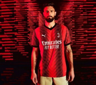
It’s fucking foul. Stop talking shite. Looks like Giroud has been run over by a tank.
Deutsch Wolf
Sponsored by Amazon Prime. DM me for discounts...
- Joined
- Oct 16, 2009
- Messages
- 113,752
- Reaction score
- 44,570
Deutsch Wolf
Sponsored by Amazon Prime. DM me for discounts...
- Joined
- Oct 16, 2009
- Messages
- 113,752
- Reaction score
- 44,570
Looks a bit 80s for me the Rangers one, and in a "Steve Bull Stand executive boxes" way, not a "The Style Council were really underrated in retrospect" way.
- Status
- Not open for further replies.


